WHAT I DID
|
RESULT
|
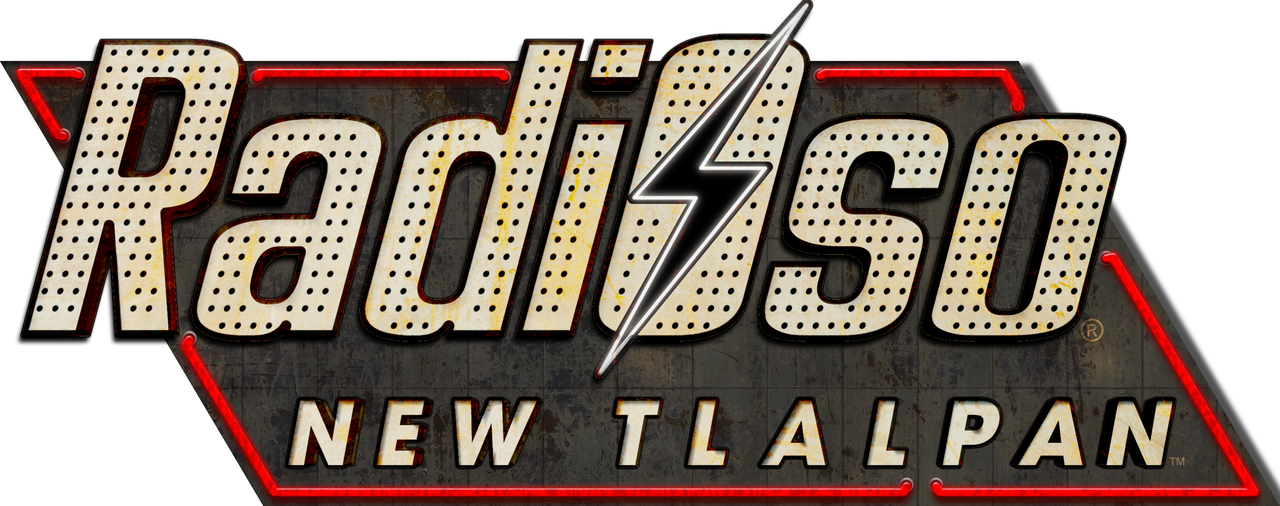
Ever wondered
what if a random internet radio station had a parody logo? And
said parody logo was no more than another that Fallout: New
Vegas?
Well, this happened once, when RadiOso Podcast was making an
episode about Atompunk. I decided to make a joke-parody logo
about it... And well, it ended being more than that!
I really got into recreating the fine details from the New
Vegas logo, such as the neon-red bulbs, the rust, the 3D
feeling from it... Everything! |

|
One of my simpler logos, yet,
the very first one.
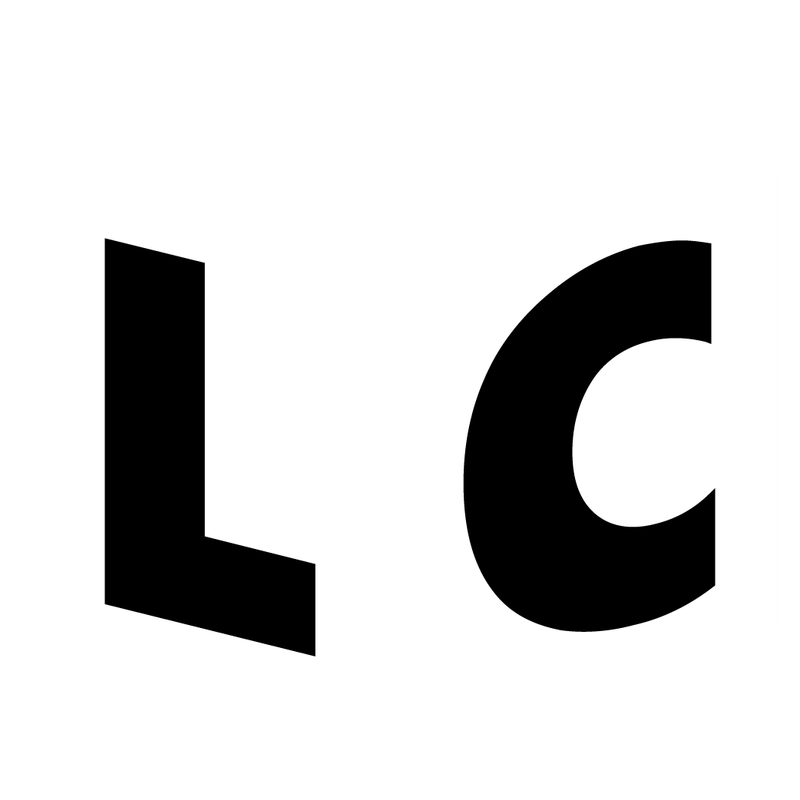
When I was making Lucid Creations, I was choosing between
having a very long logo or one of those that looks from Canva
itself.
I wanted something simple yet recognizable, so I came with an
idea after I was playing around with fonts over Illustrator.
Cinerama. Cinerama was the font that gave me the idea. A cube,
or well, a squished cube. Of course, Cinerama doesn't
autocompletes the gap between the letters, but I just did it
as soon I converted the font into a vectorized object. |

|
Another simple logo, yet again
from Fallout. This time, from my personal project: Fallout:
Mexico (or stylized to FOMX).
FOMX's logo is actually an almost no brainer one because it
utilizes the Overseer font, which is just the Fallout font.
The amazing part from it comes with the "Mexico" text part,
which is made by customizing the Mexcellent font.
And you'll wonder "why?" Well, the Mexico Olympics of 1968
uses this very similar (yet not the same, Mexico68 is still
somewhere on Mexico's Gov. archive) font. Which my own Fallout
Project bases its visual identity. Anyways, I re-fixed the
font to look similar (almost the same) as it did back in 1968.
|

|
One of my favorite pastimes is
recreating or creating stuff for ARG use (or just a more
detailed way to view an idea).
I'm very proud about many of those works, ranging from simple
posters, postcards, polaroid photos to full-on newspapers,
websites (just a picture, of course) and other.
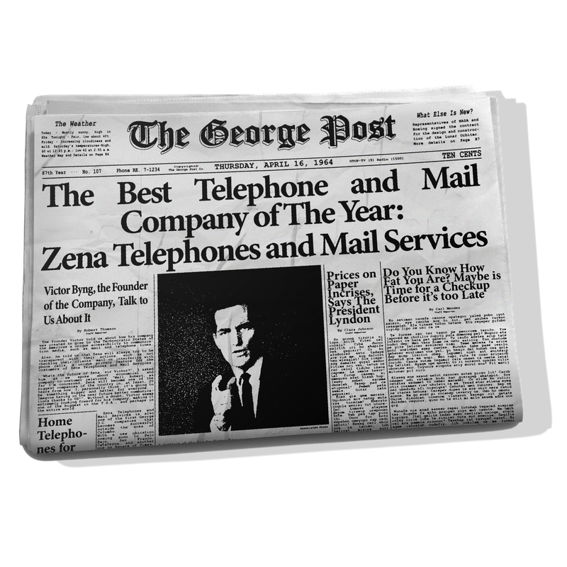
Here, is one of my favorites, a newspaper from the Oppression
Universe. It's about Zena-Corp, back in the 60s. This adds a
layer of both lore and "ARGy" elements to it.
Of course, the image present on this website is the newspaper
folded (coming from a mockup), clicking on it will open the
ACTUAL newspaper. You can appreciate the ink-texture, the
paper-texture and more. |

|


